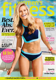


Now that I have an idea of what I'm doing I need to start thinking of how my cover lines are going to look. The positioning of them will either benefit my project or tare it down. These 3 magazine cover from 3 different brands are just a fraction of what I've looked at to get inspiration.
I found that most magazine covers for the fitness genre have the mass head covered by the model, but still leaving enough for the reader to know what magazine they are reading. These magazines have a mixture of about 2 to 3 colors that bring focus to certain articles they will find when they open the magazine. These colors are captivating and mix well with the themes, they not to much. All these magazines have atlas one article that has a number in it like "15 moves for healthy glow skin". The main article is the biggest one out of them all bring the most attention to it. The rest of the articles have catchy names that will make the reader interested in them. All of these aspects will come into consideration when I make my draft layout.
No comments:
Post a Comment