so know that we have our content somewhat done, I have decided to start looking about what I am going to write about for my 2 page spread. Since the magazine that we are creating is all about fitness I thought that the best type of article would be to do it on a trainer. I want to get a fitness trainer who's been in the business for a ling time and write about what works. Thats going to be on one side, an interview talking about the trainer and the exercises that she feels has been the best and that she sees improve her gym participants. Fitness magazines are filled with new ways on how to improve the body. On the other side of my 2 page spread I want to document the exercises that the instructor talks about. This will help the readers get the best knowledge on how exactly to do the exercises. These are just some ideas that I have for the 2 page spread, nothing is set in stone yet. Fitness magazines are also filled with recipes and equipment that people can use during exercises I could go down one of those routes too.
Friday, March 31, 2017
Wednesday, March 29, 2017
Content
Now that our cover page has the final details before working on the pictures, we have decided to move onto the table of context. This will be one pages only fairly simple and noncomplex as that is the style that most fitness magazines use. They include few words, little descriptions and pictures to draw attention.


After looking at some examples and analyzing what each content had we have created our own style to fit our magazine. The magazines have bolded article titles, bold numbers that follow. Each content has at least one picture that lets the reader know what the magazine is about. The articles have little descriptions that follow under the title. Out content will include all these important features.

Tuesday, March 28, 2017
Changes
Hey guys!
There have been a few new changes sine the last time I updated. For starters we changes the color theme of the magazine. Now we are using the colors pink and yellow, we think that this will make our target audience more attracted to the magazine cover. We got inspiration from the sports magazine below.


There have been a few new changes sine the last time I updated. For starters we changes the color theme of the magazine. Now we are using the colors pink and yellow, we think that this will make our target audience more attracted to the magazine cover. We got inspiration from the sports magazine below.

Our target audience is women and they like bright colors that are easy to read. The yellow and pink contract each other very well making it even more appealing to women. This magazine has the layout style that we are looking for.

Sunday, March 26, 2017
Layout
My group and I have found it difficult to settle on a layout that we all love. Fitness magpies have various color that go with it that we have to decide on. We al also have to have captivating words that our target audience will find attractive.
To start our layout off we decided to finalize the font and magazine colors. We choose Red masthead and yellow sub-linings. These are complementary colors that a lot of women's fitness magazines use to allure their audience. After looking at various magazines we decided on the location of each article. We will have 3 little sib-linings and then 1 big article title on the bottom left of the magazine, larger then all the other ones so that our readers understand that it's the cover story, bring in the most attention.

To start our layout off we decided to finalize the font and magazine colors. We choose Red masthead and yellow sub-linings. These are complementary colors that a lot of women's fitness magazines use to allure their audience. After looking at various magazines we decided on the location of each article. We will have 3 little sib-linings and then 1 big article title on the bottom left of the magazine, larger then all the other ones so that our readers understand that it's the cover story, bring in the most attention.

Thursday, March 23, 2017
Maximize
He guys, so as you all know we have decided to change the font to something that is a lot more delicate looking , not as bold and masculine. After hours of trying to find the perfect font we went onto canva to start our design and here is were we found our font. The font is called crushed and it more skinny and feminine for our target audience.


Compared to our first font we think that this font will have a higher chance at catching females attention. Most women magazines show that these are the font types the women are more attracted too. Men like bold and women like delicate clean looking fonts.
Tuesday, March 21, 2017
Changes to come
After going back and re looking at our magazines progress we decided to change a few things. The font that we decided on was changed because when we looked at it the font seemed to masculine and bold. The other magazines that we looked at like Fitness were more girly looking. The font we picked looked to manly for the target audience we were trying to attract. Look at these comparisons:


The male magazine is masculine looking. The font is bold and big. On the other hand you have the woman's magazine that is more delicate looking, with a font that is more skinny. This font is more attractive to women.
Sunday, March 19, 2017
Layout Draft
After doing extensive research on the layout of fitness magazines Ive come up with a layout that I think will be beneficial. The layout may change little later on as I get more inspiration.


The image above is the layout I came up with. It has all the aspects I found will doing my research. The mass head is big and in the center, it will be red. The model will be overing a portion of it. The main story will be the biggest one as shown in the picture. One article will have a number in it and the others will have catchy names, these are not the definite names of the articles they are draft name . I think I can come up with better names. We've added the issue month, some magazines have it some don't. Various colors will be used as well when it comes to the writing to capture attention, the other fitness magazines used colors like blue, pink, and yellow to do this.
Saturday, March 18, 2017
Layout Inspirations/ Cover Lines
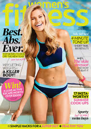


Now that I have an idea of what I'm doing I need to start thinking of how my cover lines are going to look. The positioning of them will either benefit my project or tare it down. These 3 magazine cover from 3 different brands are just a fraction of what I've looked at to get inspiration.
I found that most magazine covers for the fitness genre have the mass head covered by the model, but still leaving enough for the reader to know what magazine they are reading. These magazines have a mixture of about 2 to 3 colors that bring focus to certain articles they will find when they open the magazine. These colors are captivating and mix well with the themes, they not to much. All these magazines have atlas one article that has a number in it like "15 moves for healthy glow skin". The main article is the biggest one out of them all bring the most attention to it. The rest of the articles have catchy names that will make the reader interested in them. All of these aspects will come into consideration when I make my draft layout.
Friday, March 17, 2017
Title Design
Every magazine has a Title that defines them. When a magazine becomes noticed readers start to acknowledge the magazine by the name. Big magazines have names that define them and capture there readers attention. The names is a quick way to know what the magazine is going to be about.
I started the design of our fitness magazine. We decided that it needed o be something that will really captivate and catch our readers attention. We wanted a design that would be easy to read and easy to remember. The color that we make out name is also very important. Magazines pick colors that will go with their theme. These colors if the magazine gets noticed enough become signature colors for example, the Time magazine color is a signature red, that their audience already knows.
For our name we decided to go with red. Red is said to be the color that is associated with energy, strength, power, determination, and passion. This is exactly what we want our readers to feel when they look at the front cover of our magazine. For the design of our name we looked through 100 of different fonts to pick one that will be distinguishable to our readers. We found ours on dafont.com, a really easy to use website.


Monday, March 13, 2017
Inspiration
In your group today we decide that in important aspect that we need to start in is the Design and name of our magazine. Names are extremely important in the design of anything. If it has a catchy name or design that is appealing to the eyes it has a better change of captivating its readers and intriguing them in learning more and buying the magazine. We decided on the name "Maximize" for our magazine, because most fitness magazines have an inspirational word as their title to attract their target audience. We found inspiration in these:


Sunday, March 12, 2017
My Blog
Now that you guys have a better understanding go what the purpose of this blog is, lets go more in depth. This blog is going to act as your guide through all the steps i will be taking to make my final master piece with my group of course. We will be updating this weekly showing every little bit of progress as we go.
Links and drafts will be going up later as we move forward and advance with this process of editing and reviewing. I will be placing drafts of my cover page, table of context, and 2 page spread on this blog for you guys all to enjoy. Links to where I might have got information or inspiration will be linked here as well, for you guys to have a more in depth understanding everything that is going on. Also, draft articles might be going up to see what you guys think.
We have also decided this week to use the color red. Red is a color of strength and we want all of our female readers to feel strength and empowered to be their best version. Red is fierce and will bring the message to our readers. It will be come signature throughout the magazine.
The Title
Now, that we have a target audience that we need to bring in and wow with our work, a creative title might come in handy. Magazines are universal and one important aspect about them is there names. A good magazine has a short name that gets to the point, that shows there readers exactly what they are about.
For our fitness magazine we looked up words that had to do with all things fitness and health. We wanted something that would standout and act as a inspiration to our readers. Many words that we came up with words like, "Endurance, Strength, Health". We thought that these were all good choices but decided to go with "Maximize", this is a inspirational word that will help our readers capture the idea that they can maximize their opportunities with a little help from us. This word is seen as a positive to readers and its short and sweet, right to the point.
For our fitness magazine we looked up words that had to do with all things fitness and health. We wanted something that would standout and act as a inspiration to our readers. Many words that we came up with words like, "Endurance, Strength, Health". We thought that these were all good choices but decided to go with "Maximize", this is a inspirational word that will help our readers capture the idea that they can maximize their opportunities with a little help from us. This word is seen as a positive to readers and its short and sweet, right to the point.
The Decision
In a group discussion, we had to figure out what we wanted for our project. The type of project had already been previously decided, a magazine. Now, that we have an idea of what we want we have to choose a genre as a group. We came up with several ideas and decided to go with a fitness magazine, with all the fun facts and articles on everything fitness.
As a group we are going to have to be looking of research in regards to the audience that we would like to attract and the best way to do so. The magazine will be targeting women that are of 20-38 year of old. This conclusion was drawn by observation and research of other fitness magazines throughout the internet. Figuring that this would be the best target audience for our magazine to have the highest success rate possible.
As a group we are going to have to be looking of research in regards to the audience that we would like to attract and the best way to do so. The magazine will be targeting women that are of 20-38 year of old. This conclusion was drawn by observation and research of other fitness magazines throughout the internet. Figuring that this would be the best target audience for our magazine to have the highest success rate possible.
Subscribe to:
Posts (Atom)