Media studies blog
Tuesday, April 11, 2017
Sunday, April 9, 2017
2 page layout
For the two page spread whats going to happen is that one side is going to be an article on a fitness instructor. The article is going to talk about why she likes it, what she gets from it and anything else she might want to talk about. The article will talk about all her achievements and the way she got to the place she's in. It will be centered in yoga because the second page will be example exercise that have to do with yoga. The second side will have pictures in order of sun salutations, with descriptions on each one and the names of each. The theme of pink will process throughout these two pages. The pages are fairly simple because thats what fitness articles have The article is easy to read because the articles I found had no complicated language and they were straight to the point.
I still need to finish the descriptions on the second pages but this is the layout. Easy to see and easy to read. The descriptions will be small and quick because people want to know how to do it and fast.
Wednesday, April 5, 2017
The final Cover
We finally learned how to photoshop the front cover of the magazine. It was very time consuming but completely worth the final result. We decided to use black and whit with the pink title because the colors give a good contrast. This was done in a lot of other magazines like, sports magazine. The articles that are in the front cover are appealing to the eyes. The magazine is not packed with information because fitness magazines are moron the simple side. I tried to play with the words to make it more attractive with the titles of the articles. The cover story is the biggest one on the top left of the magazine.
For the cover the inspiration we got came from these examples:
Tuesday, April 4, 2017
What's New
Hey guys,
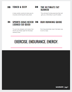
This is the final week of that I can edit and design my project. Im very excited on how it coming out. The final layout was chosen for the table of content. Fitness magazines are simple when it comes to table of content with few words. We keep the theme of pink going through the cover to the table of content, so that the magazine is themed because we saw that some fitness magazines do this. The continuation of the color of pink will make it more appealing to our target audience.
This is what we chose for the design for our table of content:
Mine is not compete yet I still need the last picture for it. But the article names are complete. For the article names I looked at real magazines like health to come up with creative names that go with our genre. The words that I used were frequently used in other magazines like the word "sexy" because this is what our readers want and what will bring them to us.
Friday, March 31, 2017
Update
HI guys,
so know that we have our content somewhat done, I have decided to start looking about what I am going to write about for my 2 page spread. Since the magazine that we are creating is all about fitness I thought that the best type of article would be to do it on a trainer. I want to get a fitness trainer who's been in the business for a ling time and write about what works. Thats going to be on one side, an interview talking about the trainer and the exercises that she feels has been the best and that she sees improve her gym participants. Fitness magazines are filled with new ways on how to improve the body. On the other side of my 2 page spread I want to document the exercises that the instructor talks about. This will help the readers get the best knowledge on how exactly to do the exercises. These are just some ideas that I have for the 2 page spread, nothing is set in stone yet. Fitness magazines are also filled with recipes and equipment that people can use during exercises I could go down one of those routes too.
Subscribe to:
Posts (Atom)


