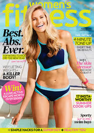
After looking at some examples and analyzing what each content had we have created our own style to fit our magazine. The magazines have bolded article titles, bold numbers that follow. Each content has at least one picture that lets the reader know what the magazine is about. The articles have little descriptions that follow under the title. Out content will include all these important features.
Wednesday, March 29, 2017
Content
Now that our cover page has the final details before working on the pictures, we have decided to move onto the table of context. This will be one pages only fairly simple and noncomplex as that is the style that most fitness magazines use. They include few words, little descriptions and pictures to draw attention.
Tuesday, March 28, 2017
Changes
Hey guys!
There have been a few new changes sine the last time I updated. For starters we changes the color theme of the magazine. Now we are using the colors pink and yellow, we think that this will make our target audience more attracted to the magazine cover. We got inspiration from the sports magazine below.
Our target audience is women and they like bright colors that are easy to read. The yellow and pink contract each other very well making it even more appealing to women. This magazine has the layout style that we are looking for.
Sunday, March 26, 2017
Layout
My group and I have found it difficult to settle on a layout that we all love. Fitness magpies have various color that go with it that we have to decide on. We al also have to have captivating words that our target audience will find attractive.
To start our layout off we decided to finalize the font and magazine colors. We choose Red masthead and yellow sub-linings. These are complementary colors that a lot of women's fitness magazines use to allure their audience. After looking at various magazines we decided on the location of each article. We will have 3 little sib-linings and then 1 big article title on the bottom left of the magazine, larger then all the other ones so that our readers understand that it's the cover story, bring in the most attention.
Thursday, March 23, 2017
Maximize
He guys, so as you all know we have decided to change the font to something that is a lot more delicate looking , not as bold and masculine. After hours of trying to find the perfect font we went onto canva to start our design and here is were we found our font. The font is called crushed and it more skinny and feminine for our target audience.
Tuesday, March 21, 2017
Changes to come
After going back and re looking at our magazines progress we decided to change a few things. The font that we decided on was changed because when we looked at it the font seemed to masculine and bold. The other magazines that we looked at like Fitness were more girly looking. The font we picked looked to manly for the target audience we were trying to attract. Look at these comparisons:
The male magazine is masculine looking. The font is bold and big. On the other hand you have the woman's magazine that is more delicate looking, with a font that is more skinny. This font is more attractive to women.
Sunday, March 19, 2017
Layout Draft
After doing extensive research on the layout of fitness magazines Ive come up with a layout that I think will be beneficial. The layout may change little later on as I get more inspiration.
The image above is the layout I came up with. It has all the aspects I found will doing my research. The mass head is big and in the center, it will be red. The model will be overing a portion of it. The main story will be the biggest one as shown in the picture. One article will have a number in it and the others will have catchy names, these are not the definite names of the articles they are draft name . I think I can come up with better names. We've added the issue month, some magazines have it some don't. Various colors will be used as well when it comes to the writing to capture attention, the other fitness magazines used colors like blue, pink, and yellow to do this.
Saturday, March 18, 2017
Layout Inspirations/ Cover Lines
Now that I have an idea of what I'm doing I need to start thinking of how my cover lines are going to look. The positioning of them will either benefit my project or tare it down. These 3 magazine cover from 3 different brands are just a fraction of what I've looked at to get inspiration.
I found that most magazine covers for the fitness genre have the mass head covered by the model, but still leaving enough for the reader to know what magazine they are reading. These magazines have a mixture of about 2 to 3 colors that bring focus to certain articles they will find when they open the magazine. These colors are captivating and mix well with the themes, they not to much. All these magazines have atlas one article that has a number in it like "15 moves for healthy glow skin". The main article is the biggest one out of them all bring the most attention to it. The rest of the articles have catchy names that will make the reader interested in them. All of these aspects will come into consideration when I make my draft layout.
Subscribe to:
Posts (Atom)